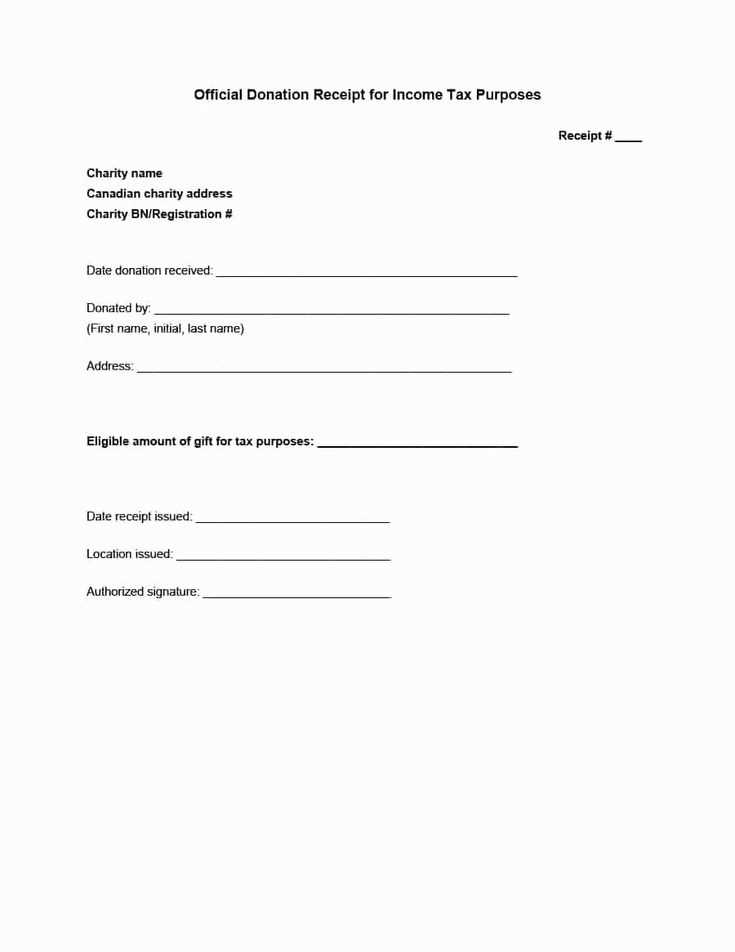
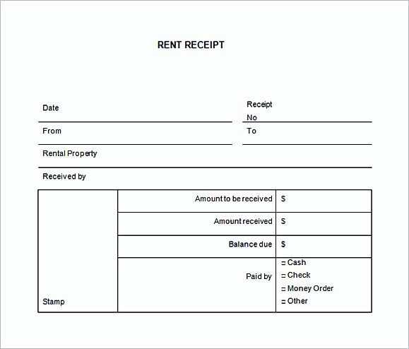
For a practical and clean receipt layout, start by focusing on the most critical details. Include the date, store name, and itemized list of purchases with clear descriptions and amounts. Use simple formatting to enhance readability, ensuring that each element stands out but is aligned properly.
Include the transaction total clearly at the bottom of the list, followed by any applicable taxes. Keep the font size consistent and avoid cluttering the space with unnecessary information. Use whitespace wisely to make sure each section is easy to scan.
To keep things organized, consider adding a footer with your store’s contact information or a thank-you note. This adds a personal touch without distracting from the main content. Lastly, test the template on various devices or paper sizes to ensure compatibility and legibility.
Small Receipt Template

For a compact and functional receipt template, focus on clarity and organization. A simple structure ensures the information is easy to read and understand. Here’s how you can set up your own:
- Header: Include the business name, address, and contact details at the top. This creates an immediate reference point for the customer.
- Transaction Details: Display the date and time, followed by the list of items or services provided. Keep the descriptions short and clear.
- Price Breakdown: For each item, list the quantity, unit price, and total price. This transparency helps customers understand the charges.
- Total: At the bottom, include a total cost line. Make sure it’s prominent and easy to identify.
- Footer: Optionally, add a thank you message or any return policy notes. This can be an excellent place to reinforce your brand identity.
Keeping the layout simple and easy to follow enhances the user experience. Customize the font and spacing to ensure everything fits well within the small format.
Choosing the Right Size for Your Template

Opt for a standard size of 3 x 7 inches (76 x 178 mm) for receipts. This is widely compatible with most receipt printers, ensuring a consistent fit and readability. If your printer supports multiple sizes, test different options to find the most practical fit for your business needs.
For smaller receipts, such as for quick transactions or minimal information, 2.25 x 7 inches (57 x 178 mm) works well. This size reduces paper waste while maintaining space for essential details. Larger templates are useful for transactions involving more data, like itemized receipts or invoices, where 4 x 6 inches (102 x 152 mm) may be necessary.
Keep in mind that the size should also align with your branding. Avoid making the template too small, as it can impact legibility, especially for customers with visual impairments. Similarly, a receipt that is too large may appear cluttered and wasteful.
Designing Key Elements for Simplicity
Focus on readability and minimalism. Use a clear, legible font and maintain consistent text sizes for headings and amounts. Prioritize space–avoid cluttering the receipt with unnecessary information. Include only what is required for the transaction, such as the item, price, and total. Ensure that each section is easy to distinguish by using subtle lines or spacing.
Keep color choices limited to enhance legibility. Neutral backgrounds with dark text work best, and if you need color, use it sparingly for highlights like totals or labels. This draws attention to the most critical details without overwhelming the reader.
Organize information logically. Place the most relevant data at the top, such as the business name and date, followed by the list of items and their prices, and end with the total. A consistent flow helps customers quickly locate what they need without confusion.
For small receipts, avoid excess verbiage. Stick to simple, concise terms like “Subtotal,” “Tax,” and “Total.” Clear labels will help customers easily interpret the receipt without needing additional explanation.
Customizing Layout for User-Friendly Printing

Choose a compact layout to make receipts easy to read and print. Focus on clear separation between key information like item names, prices, and totals. This reduces clutter and ensures that everything is legible on a small receipt.
Use a consistent font size for text and a larger font for important figures, such as the total cost. This visual hierarchy directs the user’s attention to critical data.
Ensure that there is enough white space around each section, preventing the text from appearing cramped. A well-spaced layout improves readability and enhances the user experience, especially for quick transactions.
Consider using simple icons or small graphics for added clarity. A minimal approach ensures that these elements don’t distract from the core information.
Adjust the margins to fit content within the width of the receipt without cutting off details. Testing your layout on different printer models can help avoid formatting issues.
Test the layout regularly to ensure that all information is printed properly across various devices. A consistent, easy-to-read format enhances the overall experience for users.