Design your receipt and invoice emails with a focus on readability and clarity. Ensure that your template is mobile-friendly and adjusts well to various screen sizes. This will increase customer satisfaction and prevent the risk of your emails looking unprofessional on different devices.
Start with a clean layout. Avoid clutter and keep the most important details like order number, date, and payment summary at the top. Place contact details and additional information in a footer to avoid overwhelming the user. Make sure all text is legible on both desktop and mobile devices, and test for different screen resolutions.
Use clear sections and well-defined headers. Each part of the email should be easy to scan. Break down information into digestible parts like payment summary, shipping info, and contact support. This improves user experience and makes it easier for customers to find what they need quickly.
Consider including a call to action (CTA) like a “View Details” or “Download PDF” button. This helps your customers interact with the content and access additional information they may need. Ensure these buttons are big enough to tap on a smartphone without errors.
Lastly, test your template with various email clients to ensure compatibility. Some email programs may render elements differently, so it’s important to confirm that your design remains intact across all major platforms.
Here is an option with reduced repetition:
To simplify your receipt and invoice templates, avoid redundant sections by grouping similar content logically. For example, instead of repeating the customer name, include it in the header and reference it within the body of the email using a dynamic tag, reducing the need to manually add it multiple times.
Utilize Variables for Personalization
Use placeholders or dynamic fields for customer details such as name, address, and order summary. This cuts down on the amount of static content in your template, allowing you to focus on the core information. It also prevents the template from becoming too cluttered with repetitive elements.
Consolidate Related Data
Group items with similar functions into one section, like combining payment details with billing information. This approach minimizes repetition and keeps the layout neat and organized. Furthermore, consider employing tables for structured presentation, where each row can represent a separate transaction item without the need for multiple descriptions.
Responsive Receipt & Invoice Email Template
Designing a Mobile-Friendly Layout
Customizing Template for Various Platforms
Optimizing Content for Enhanced User Engagement
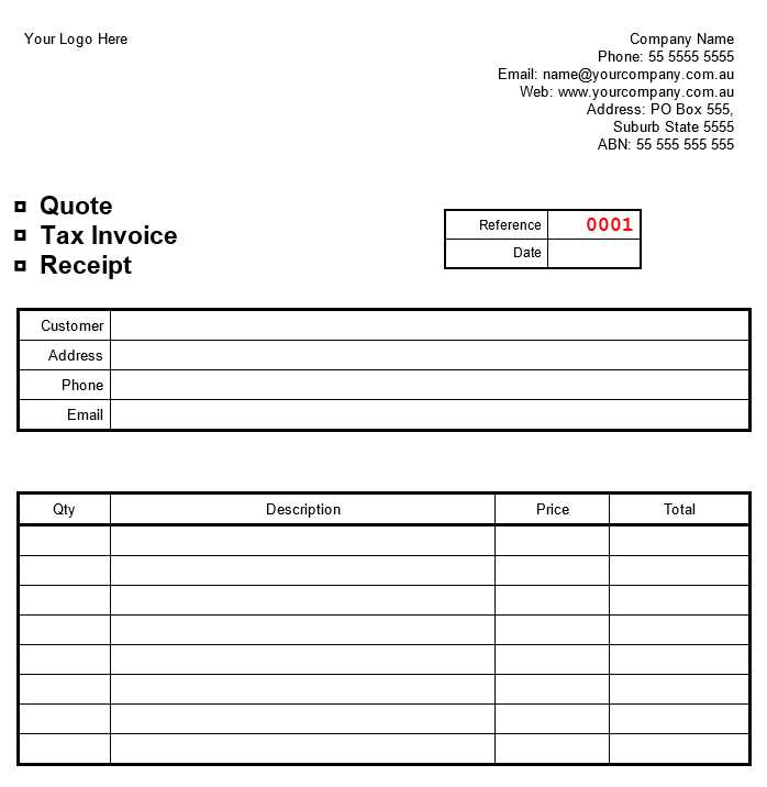
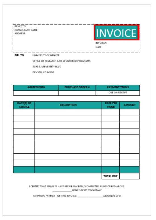
Including Essential Transaction Information for Clarity
Testing Compatibility Across Multiple Email Clients
Automating Delivery for Smooth Transactions
Ensure your email template adapts seamlessly to all screen sizes by using flexible grid layouts. Use media queries to modify the design based on the device’s width. Opt for larger fonts, single-column layouts, and ample spacing to improve readability on mobile devices.
Customizing Template for Various Platforms
Each email platform has its own quirks. Test your template on popular email services like Gmail, Outlook, and Yahoo. Adjust for their specific quirks–e.g., Gmail’s lack of support for certain CSS styles. Consider adding inline CSS to ensure consistency across platforms.
Optimizing Content for Enhanced User Engagement
Keep the content concise and to the point. Include clear call-to-action buttons like “View Receipt” or “Download Invoice.” Use a clean layout with bold headers for key sections like “Amount,” “Date,” and “Order ID.” Prioritize clarity to minimize the need for users to scroll or zoom.
Incorporate branding elements like your logo and company colors subtly to create a cohesive experience. Avoid overwhelming users with excessive information; highlight the most critical transaction details at the top.
Make the email easy to read by ensuring sufficient contrast between text and background colors. Use web-safe fonts that are easily legible on all devices.
Including Transaction Information for Clarity
Provide all necessary transaction details such as product names, quantities, prices, and taxes. Format the information in a clean, organized table. Ensure the transaction total is clearly visible and prominent. Include links to download or view the full invoice, if applicable.
Clear and transparent communication reduces confusion and helps build trust with your recipients. Make it easy for them to verify their purchases quickly.
Testing Compatibility Across Multiple Email Clients
Different email clients render HTML emails differently. Use tools like Litmus or Email on Acid to test how your template looks across various platforms and devices. Adjust the layout, font sizes, and images based on feedback from these tests to ensure maximum compatibility.
Automating Delivery for Smooth Transactions
Automate email delivery through your email service provider (ESP). Schedule receipts or invoices to be sent immediately after a purchase or transaction is complete. Ensure the automation system is reliable, as delays in delivery may affect the user experience.
Additionally, include a unique reference number in the subject line to help recipients quickly identify their email in their inbox. A well-timed, accurate email builds confidence and improves the user experience.
Postaraalsya sokhranit’ iskhodnyy smysl, pri etom izbegaya izlishnikh povtory.
To create an engaging and effective receipt or invoice email template, focus on maintaining clarity while keeping the content straightforward. Ensure that key details like the company name, customer information, and transaction summary are immediately visible.
Structure for Readability
Organize the information in a clean, hierarchical manner. Use headings and bullet points to break down sections clearly, such as item descriptions, quantities, and pricing. This helps the reader quickly locate relevant information without feeling overwhelmed by dense paragraphs.
Formatting and Design
Avoid heavy use of images and ensure that text is easy to read on both desktop and mobile devices. The design should align with your brand identity while being functional and simple. Use bold for headings and key amounts, and ensure there is enough white space to separate different sections visually.
Remember to include clear call-to-action buttons like “Download PDF” or “View Details” to guide your customer effectively. This enhances the user experience and encourages further engagement.