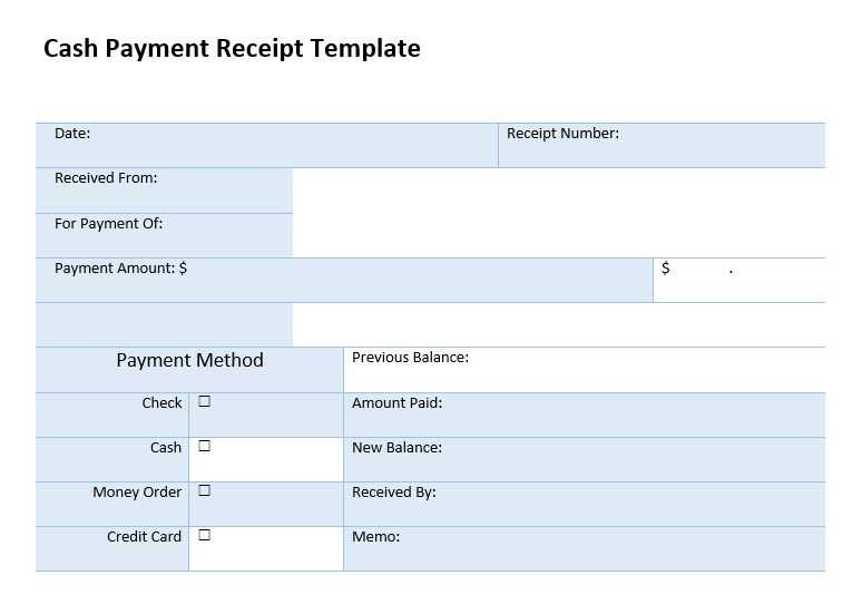
Use Bootstrap to create a clean and professional payment receipt template with responsive design. With its grid system and pre-styled components, you can quickly assemble a structured layout that looks great on any device. A well-designed receipt should include key details such as transaction date, payment method, billing details, and itemized charges.
A Bootstrap receipt template typically uses a card component to present information neatly. Add a table for itemized details and utilities for spacing, alignment, and typography. For example, use .text-end to align totals and .fw-bold to highlight important figures.
Enhance usability with Bootstrap icons for payment methods and a print button using window.print(). To improve branding, integrate company colors and a logo using Bootstrap’s img-fluid class. With just a few lines of code, you can create a sleek and functional receipt that enhances user experience.
Payment Receipt Template in Bootstrap

Use Bootstrap’s grid system and utility classes to create a clean, structured payment receipt. Keep it simple and readable by using a card layout with essential details like transaction ID, date, amount, and payment method.
Basic Structure
Wrap the receipt in a div with the class card for a structured look. Use card-header for the title, card-body for transaction details, and card-footer for additional notes or support links.
Code Example

Here’s a practical Bootstrap-based receipt template:
<div class="container mt-4">
<div class="card shadow-sm">
<div class="card-header bg-primary text-white">
Payment Receipt
</div>
<div class="card-body">
<p><strong>Transaction ID:</strong> #123456789</p>
<p><strong>Date:</strong> Feb 11, 2025</p>
<p><strong>Amount:</strong> $150.00</p>
<p><strong>Payment Method:</strong> Credit Card</p>
</div>
<div class="card-footer text-muted">
Need help? <a href="#">Contact Support</a>
</div>
</div>
</div>
Customize colors, spacing, and typography using Bootstrap’s utility classes. To enhance readability, adjust padding with p-3 and add margins with mt-3 or mb-3. Keep the layout responsive by nesting it in a container.
Structuring the HTML Layout for a Bootstrap Receipt
Use a clean, structured layout to ensure readability and easy customization. Start with a container to center the receipt and apply responsive behavior.
<div class="container my-4">
<div class="card p-4 shadow-sm">
<h3 class="text-center mb-3">Payment Receipt</h3>
<div class="d-flex justify-content-between">
<div>
<p class="mb-1"><strong>Company Name</strong></p>
<p class="text-muted">123 Business St, City, Country</p>
</div>
<div class="text-end">
<p class="mb-1"><strong>Date:</strong> 2024-02-11</p>
<p class="mb-1"><strong>Receipt #:</strong> 000123</p>
</div>
</div>
<hr>
<h3 class="mb-3">Payment Details</h3>
<table class="table table-bordered">
<thead>
<tr>
<th>Description</th>
<th class="text-end">Amount</th>
</tr>
</thead>
<tbody>
<tr>
<td>Service/Product Name</td>
<td class="text-end">$100.00</td>
</tr>
</tbody>
<tfoot>
<tr>
<th class="text-end">Total:</th>
<th class="text-end">$100.00</th>
</tr>
</tfoot>
</table>
<div class="text-center mt-3">
<p class="text-muted">Thank you for your payment!</p>
</div>
</div>
</div>
Use Bootstrap’s grid and utility classes to maintain alignment and spacing. A card provides a structured, bordered layout. Tables organize payment details, and text utilities ensure clear distinctions between sections.
Applying Bootstrap Classes for Styling and Responsiveness
Use Bootstrap’s grid system and utility classes to ensure a structured, responsive design. The .container class provides proper padding and centers content, while .container-fluid stretches across the full width.
- Grid Layout: Apply
.rowand.colclasses to organize content. For example,.col-md-6ensures a two-column layout on medium screens and larger. - Text Alignment: Use
.text-center,.text-start, and.text-endfor quick adjustments. - Spacing: Bootstrap’s margin and padding utilities (
.m-3,.p-4, etc.) help fine-tune spacing without extra CSS. - Buttons: The
.btnclass, combined with variants like.btn-primary, creates stylish buttons with built-in hover effects. - Tables: Add
.table,.table-striped, and.table-hoverfor clean, responsive tables.
To make components adjust dynamically, combine .d-flex and .justify-content-between for flexible layouts. Media queries are rarely needed, as Bootstrap’s breakpoints handle most scenarios automatically.
Integrating Dynamic Data into the Receipt Template
Use a templating engine like Handlebars.js or embed server-side logic in PHP, Node.js, or Django to populate the receipt dynamically. This ensures that each transaction reflects unique details such as customer name, purchase date, and itemized costs.
Using JavaScript for Dynamic Content
Leverage JavaScript to inject data into the template without reloading the page. Fetch transaction details via an API and update the receipt using innerHTML or template literals:
fetch('/api/receipt-data')
.then(response => response.json())
.then(data => {
document.getElementById('customer-name').textContent = data.customer;
document.getElementById('receipt-date').textContent = data.date;
document.getElementById('total-amount').textContent = `$${data.total.toFixed(2)}`;
});
Binding Data with a Backend Framework

For server-side rendering, frameworks like Laravel or Express can pass transaction data directly to the Bootstrap template. Example in Laravel Blade:
<td>{{ $receipt->customer_name }}</td>
<td>{{ $receipt->date }}</td>
<td>$ {{ number_format($receipt->total, 2) }}</td>
Whether using client-side or server-side integration, ensure data security by validating inputs and sanitizing outputs before rendering them in the receipt.


