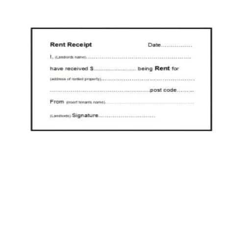
Creating a clean and functional receipt template with Bootstrap is quick and simple. Focus on key components like structured grids, typography, and customizable styles to design a professional-looking receipt that adjusts seamlessly across devices.
Start by using the .container class to provide a consistent layout. The .row class helps create a flexible grid system, ensuring that all elements are neatly aligned. A well-organized grid ensures your receipt is readable on both desktop and mobile screens.
For the heading section, .text-center can be applied to center the title. Utilize .mb-4 for proper spacing between the elements, giving the receipt a balanced and organized appearance. Incorporating Bootstrap’s utility classes allows for quick adjustments without writing extensive custom CSS.
Don’t forget to style the item list using .table and .table-striped for a neat, easily readable format. Add .table-bordered to include borders for separating each row, giving your receipt a structured feel.
Finally, the total and payment sections can be emphasized with .font-weight-bold or .h4 to make the information stand out. With these tips, your Bootstrap receipt template will be both functional and visually appealing.
Bootstrap Receipt Template
Use Bootstrap’s grid system and pre-styled components to quickly create a responsive receipt template. Here’s how you can structure it:
- Grid Layout: Create a clear division between the header, items, and footer using Bootstrap’s grid system. This ensures that the layout adjusts to various screen sizes.
- Header Section: Include the store name, logo, and receipt title. Use a
.rowfor alignment and.col-12for full-width elements. - Item List: Use a table with Bootstrap’s
.tableclass to display purchased items, quantity, and prices. This ensures the receipt remains clear and readable. - Footer: Add payment details, including total price and taxes. Use
.text-rightto align numbers to the right for a neat presentation.
Example of a simple structure:
Receipt


Item
Price


Item 1
$10.00


Item 2
$20.00


Total: $30.00
This template is flexible and can be customized further with your brand’s styling or additional sections like discounts or payment methods.
Customizing Layout for Different Receipt Styles
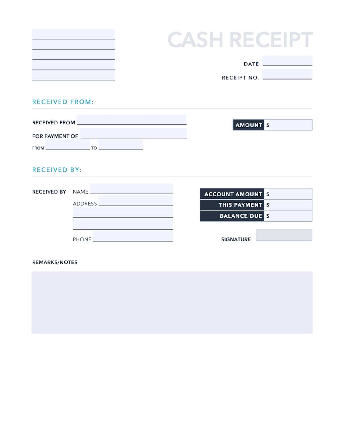
Adjust the receipt layout to match the style of the business or service being offered. For example, a minimalist design works well for modern cafés, while a more detailed layout suits high-end retail stores. Use Bootstrap’s grid system to create flexible columns that can adapt to various screen sizes, ensuring that the layout remains clean and readable on all devices.
1. Simple and Minimalist Design
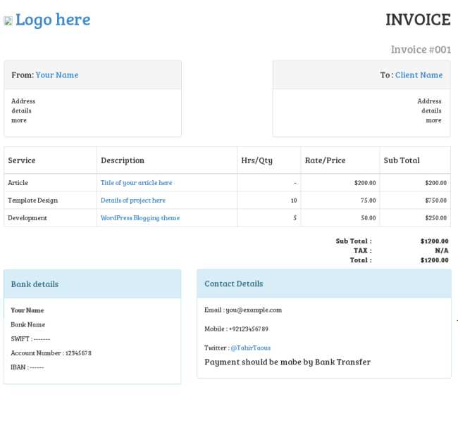
For a simple receipt style, focus on using basic typography and minimal elements. A single-column layout with a clear, readable font like Arial or Helvetica keeps the design clean. Use a larger company name at the top, followed by the itemized list of purchased goods. Bootstrap’s container class can center the content and give it a well-structured appearance.
2. Detailed and Professional Layout
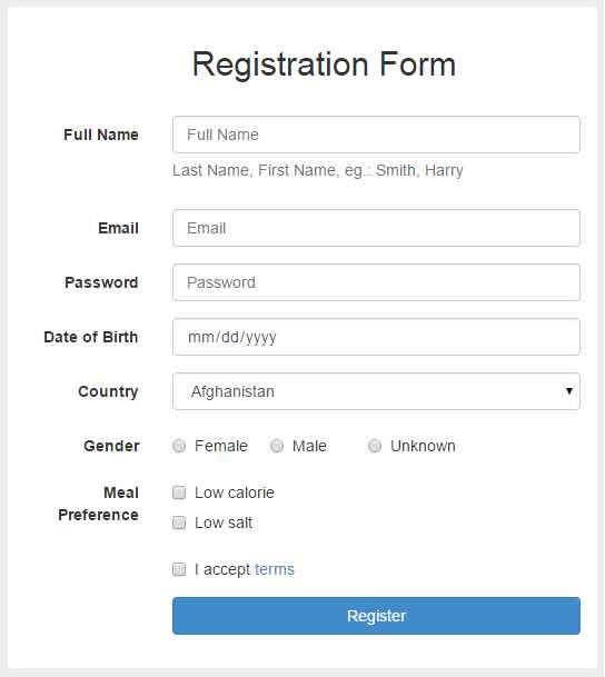
For a more complex receipt style, include sections like a logo, contact information, and a breakdown of taxes and discounts. Organize the layout with Bootstrap’s grid system into multiple rows and columns. Place the company logo in the header, followed by the item list, subtotal, taxes, and total in separate sections. This layout ensures clarity, especially for receipts in retail or service-based businesses where item-level information is critical.
Integrating Dynamic Data with Bootstrap Template
Use JavaScript or jQuery to inject dynamic data into your Bootstrap receipt template. Start by fetching data from an external source, such as an API, or from user inputs within a form. Use the DOM manipulation methods to populate the template with this data.
For instance, if you’re building a receipt that includes item names, prices, and quantities, fetch these values from a data source like a database. Create a function to loop through the data and generate HTML elements dynamically, inserting them into your template. This avoids hardcoding content, allowing the receipt to update based on different inputs or API responses.
Incorporate jQuery’s `.append()` or `.html()` methods to add elements to specific sections of the template. For example, you can dynamically populate the items list or total amount fields. Here’s a small code snippet:
“`html
$(document).ready(function() {
var items = [
{ name: “Item 1”, price: 10, quantity: 2 },
{ name: “Item 2”, price: 15, quantity: 1 }
];
items.forEach(function(item) {
var row = `
`;
$(“#items-list”).append(row);
});
});
Here, the `#items-list` ID represents the section of your receipt template where the item rows will appear. By using the `.append()` method, you insert each item dynamically based on the provided data, allowing the receipt to display up-to-date information.
For a fully interactive experience, integrate real-time calculations. Update fields like totals or taxes instantly when users change input values. You can achieve this by listening for user interactions with inputs (like quantity fields) and recalculating the total price with each change.
This approach ensures your receipt template is adaptable and can dynamically reflect different scenarios or user-generated data, all while maintaining the clean and responsive design provided by Bootstrap.
Ensuring Print-Ready Formatting in Bootstrap Receipts
Use media queries to ensure your receipt template adapts to print settings. Apply a specific CSS rule for print using @media print to adjust styles when the document is printed.
Optimizing Layout for Print
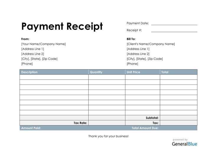
Modify layout properties like margins, padding, and font sizes within the @media print block. For instance, reduce padding around receipt content and set font-size: 12px to fit information properly on the printed page.
Hiding Unnecessary Elements

Remove elements that don’t need to appear on the printed receipt. Apply display: none to navigation bars, footers, or unnecessary images within the print media query. This will help keep the receipt clean and focused on the necessary information.
Example: Use the following CSS snippet to hide navigation on print:
@media print {
.navbar, .footer {
display: none;
}
}
Test different devices and printer settings to ensure your template looks good in a variety of print configurations. Adjust any minor discrepancies in layout, ensuring the content stays consistent across different printing platforms.
