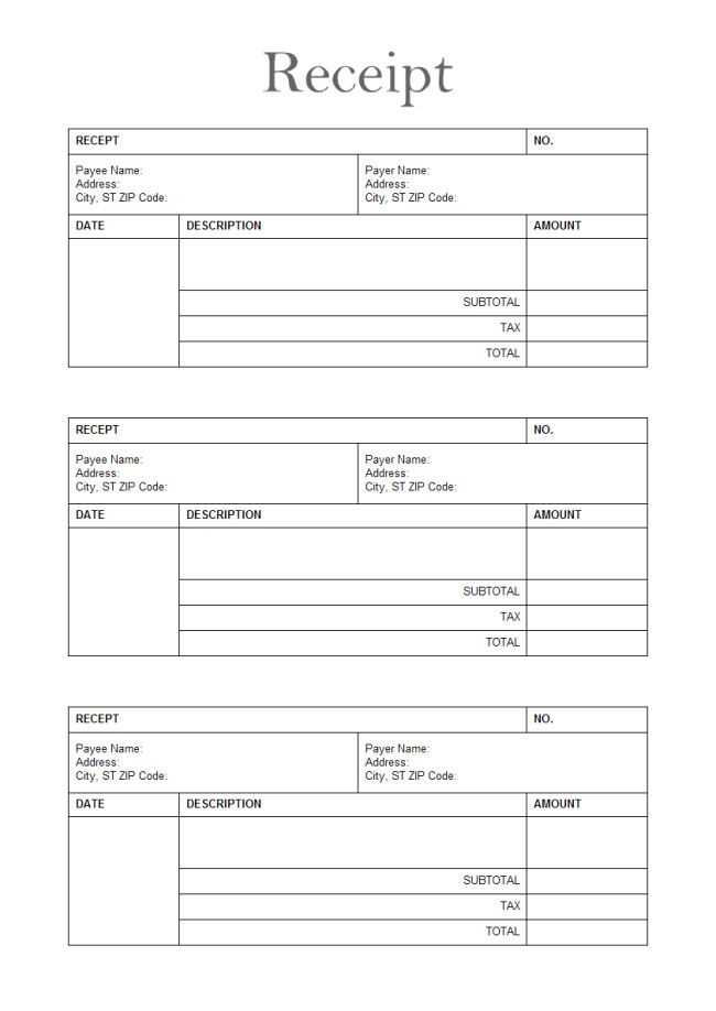
Creating a music receipt template requires simplicity and clarity. Focus on including the key details: artist name, performance date, venue, and payment amount. Make sure the template is easy to modify for different events or transactions. You can also add sections for any additional charges or tips if relevant.
Design the template to be flexible but structured. Place fields for important transaction information like payment method, time of payment, and any services provided. This will help keep records organized and transparent. For example, you might add a space for the customer’s signature, confirming that they received the service.
It’s a good idea to make the template professional yet approachable. Use a clean font and simple design elements that do not distract from the content. A well-organized format is key to ensuring that the information is easy to read and understand.
Music Receipt Template Guide
Begin by including the date of the transaction at the top. This provides a clear reference point for both the customer and the service provider.
Client Information should be listed next. Include the client’s name, address, and contact details. This ensures all parties are identifiable and that records are easily accessible.
Under the client details, specify the service or product sold. For music-related transactions, this could be a performance, session, or any media delivered. Include precise descriptions to avoid confusion.
In the next section, list the total amount due. Clearly state the agreed-upon price for the service or product, along with any taxes or discounts that apply. Use bold or italics to highlight this figure to prevent errors.
Finally, add payment details. If the payment was made, mention the method and transaction reference. If payment is pending, specify the due date and any relevant payment terms.
Using this straightforward layout helps ensure the document is clear and easy to process for all involved.
Creating a Custom Music Receipt Layout

Design a clean, straightforward receipt that highlights key transaction details. Start by focusing on the core elements that must appear clearly for the customer. Organize them in a way that minimizes clutter.
- Header: Include the store name, address, and contact info. Use a simple font and ensure it stands out.
- Date and Time: Display the date and time of the transaction clearly beneath the header.
- Itemized List: List purchased music tracks, albums, or services with their respective prices. Use bullet points or a table format to keep things neat.
- Total: Show the subtotal, tax, and total amount at the bottom in bold for easy reference.
Incorporate brand elements like your logo or a slogan subtly at the footer. Keep the font legible and the spacing consistent, so the customer can easily read all the details. Avoid unnecessary visuals that could distract from the essential information.
Lastly, include a payment method or transaction ID for future reference. This not only adds professionalism but also aids in customer support if needed.
Incorporating Key Information for Music Transactions

Begin by including the date of the transaction. This is crucial for tracking payments and for clarity on the timing of the exchange. Make sure to note the specific service or product being sold, such as music lessons, a live performance, or a physical album. Include the total amount paid, specifying the currency, and any taxes or additional charges that apply.
Details of Payment Method
Record the method used for payment, whether it’s cash, bank transfer, or a digital platform like PayPal. If applicable, include transaction IDs or references that allow both parties to trace the payment quickly if needed.
Parties Involved

Clearly identify both the buyer and seller. This should include full names or business names, contact details, and any relevant identification numbers (e.g., business registration numbers). This ensures accountability for both sides and simplifies future communication.
Tips for Ensuring Clear and Professional Formatting
Align text consistently across the template. Use left-aligned text for most information, as it is easier to read. Avoid using right-alignment or centering unless necessary for headings or specific elements.
Choose the Right Font

Opt for clear, legible fonts like Arial or Helvetica. Avoid decorative fonts, which can compromise readability. Stick to a maximum of two font types throughout the template–one for headings and another for body text.
Use Proper Spacing

Ensure ample white space between sections and elements. This makes the content less cluttered and more readable. Use consistent padding around text and between items to maintain balance.
Standardize heading sizes to differentiate them from body text. Use bold or slightly larger font sizes for headings to create a clear visual hierarchy. This helps readers easily navigate through the template.
Limit the use of colors. A simple color scheme with one or two accent colors maintains professionalism. Ensure text contrasts well with the background for readability.
Consider consistency in the alignment of important details such as dates, names, and amounts. This uniformity makes the information easy to scan.