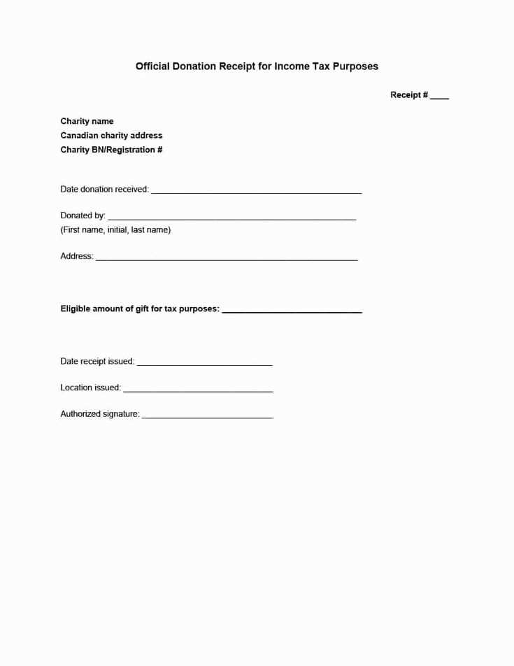
Designing a receipt template in Illustrator is a great way to create custom receipts for your business or personal use. Start by setting up your artboard to the desired receipt size. A common size is 3 x 8.5 inches, but you can adjust based on your needs. Make sure your resolution is set to 300 DPI for high-quality output, especially if you’re planning to print the receipts.
Use vector shapes for clear, sharp lines that will scale well on any print or digital version. Begin by adding basic elements like the company logo, contact information, and payment details in easily readable fonts. Consider using hierarchical design to group related elements. For example, the transaction number, date, and payment total should be prominent, while additional information can be smaller and less bold.
Illustrator offers a wide range of tools, such as grids and smart guides, to help align your text and graphics neatly. Don’t forget to add space for signatures or other personalized elements if needed. Save your template as a vector file like .AI or export it as a PDF, making it easy to adjust and print multiple copies when required.
Detailed Guide on Creating Receipt Templates in Illustrator
Creating a receipt template in Illustrator involves designing a clean, organized layout that can be easily customized for various businesses. Follow these steps to create a functional and visually appealing template.
Set Up Your Document

Open Illustrator and create a new document with a size that suits the typical receipt dimensions, such as 3 x 7 inches. Set the resolution to 300 DPI for high-quality prints.
Design the Header
- Use the Text tool to add your company name, address, and contact information. Position this at the top to make it easily noticeable.
- Incorporate a logo if applicable. Ensure the logo is clear and sized appropriately without overpowering the text.
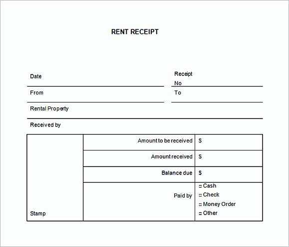
Include Itemized Details

- Use rectangular boxes to create a table where the items sold, their prices, and quantities can be listed. This will make it easy for customers to read the receipt.
- To maintain clarity, alternate row colors or use thin lines to separate different sections like item description, price, and total.
Design the Footer
- Add a section for the total amount, tax, and any discounts applied. Highlight this area so it stands out to the customer.
- Include payment methods accepted and additional contact information or disclaimers at the bottom.
Make It Ready for Print or Digital Use
Once the design is complete, save your file in a vector format like .AI or .PDF for printing. If the receipt will be used digitally, consider saving it as a PNG or JPEG for easy sharing via email or online platforms.
How to Set Up Document for Receipt Design
Set your document size to the standard receipt dimensions, typically 3 inches by 8 inches (76.2mm x 203.2mm), depending on your printer’s capabilities. If you’re unsure, check the specifications of your printer for a precise width and height.
Adjust the Document’s Color Mode
Choose CMYK color mode to ensure accurate printing results. Receipts are usually printed in black and white, but if your design includes color elements, this mode gives you a better idea of how colors will appear on paper.
Set the Resolution

Set your resolution to at least 300 DPI (dots per inch) for crisp and clear printing. This ensures your text and images remain sharp, especially for small fonts and barcodes.
Enable a bleed area of about 1/8 inch (3mm) on each side to avoid any unintentional white edges after trimming. This is crucial for designs that reach the edge of the paper.
Check the margins and adjust them according to your printer’s requirements. Most printers have their own margin constraints, so make sure your content fits within the printable area to avoid cutting off any important information.
Save your file in a compatible format such as PDF or EPS for the best quality when printing or sharing the design.
Choosing Fonts and Layout for Clear Readability
Use clear, legible fonts like sans-serif styles such as Arial, Helvetica, or Open Sans. These fonts offer a clean look and are easy to read at smaller sizes, making them ideal for receipts. Avoid overly decorative fonts, as they can make the text hard to read quickly.
Maintain a simple layout with plenty of white space. This prevents the receipt from feeling cluttered. Organize the information in a clear hierarchy, with key details such as the store name, date, and total amount in larger or bolder fonts to draw attention.
Align text consistently, either to the left or center, to guide the reader’s eye naturally through the document. Avoid excessive indentation or mixed alignments that can cause confusion. Ensure there is adequate line spacing between sections to improve readability and avoid text crowding.
Use bold or larger text for headings and important items, such as totals or transaction information. For less critical information, like product descriptions or payment methods, keep the font size smaller but still legible.
Finally, test your receipt design on different devices or printouts to ensure the fonts and layout are still easy to read in various formats and conditions. A well-organized, straightforward design ensures the information is accessible and easy to understand at a glance.
Exporting and Customizing Templates for Different Use Cases
To export your receipt template from Illustrator, first ensure all elements are correctly aligned and grouped. Use the “Save As” function and select a file format that suits your needs. For printing, PDF is ideal, while PNG or JPG works better for web use. If you plan to use the template in other software or need transparency, consider exporting it as a PNG.
For customizing the template for different scenarios, start by adjusting key elements like fonts, logos, and color schemes. Each use case may require slight changes. For example, for a retail receipt, you may want to add product descriptions, while a restaurant receipt might need a space for tips or service charges. Keep the layout consistent but adaptable to various contexts.
When exporting for digital platforms, ensure the resolution matches the display requirements. A higher resolution works better for print, while a lower resolution might be enough for screen use. Adjusting the file size might also be necessary to ensure quick loading times without compromising quality.
Finally, always preview your template in different formats to make sure it translates well across all devices and platforms. Fine-tuning your template for specific use cases ensures its utility across various mediums, whether it’s printed or digital. This process helps maintain professionalism while adapting to the demands of different users or environments.