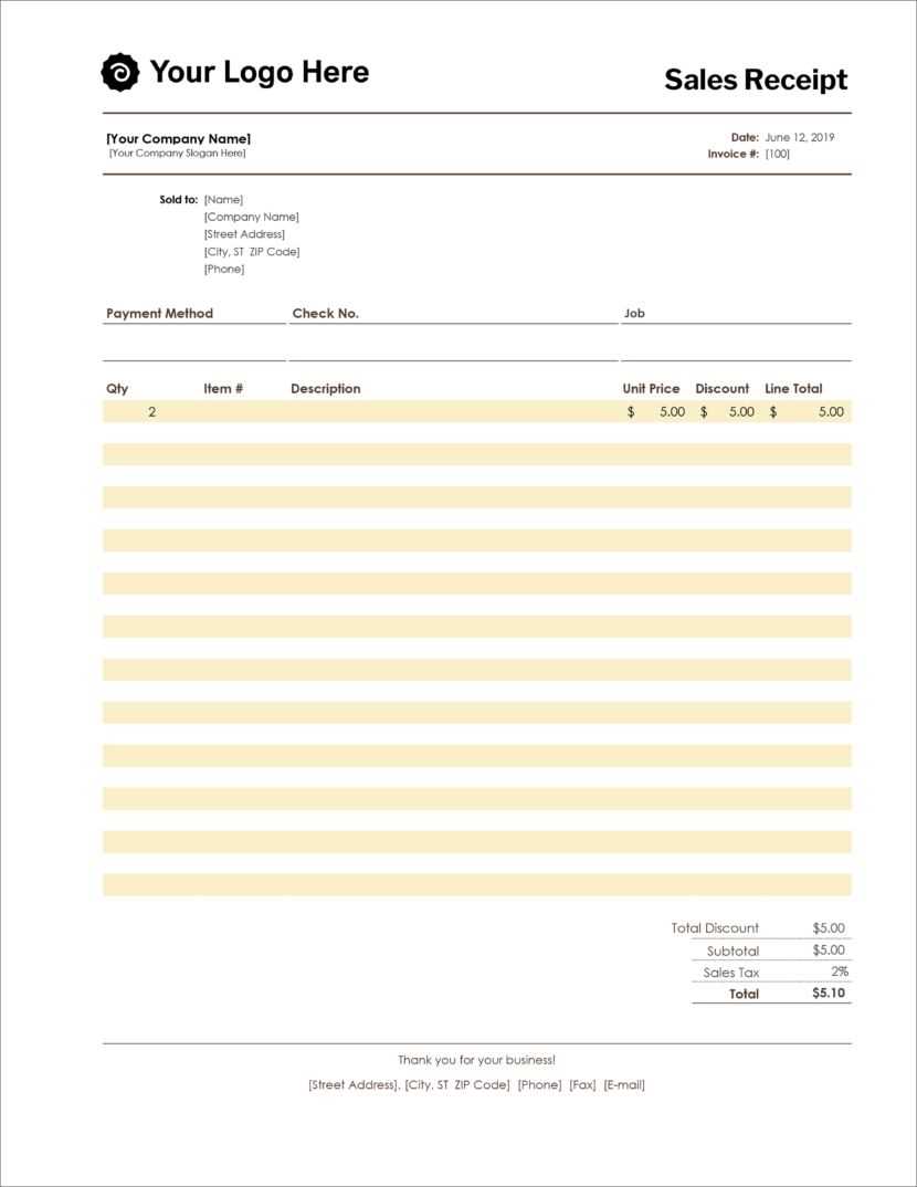
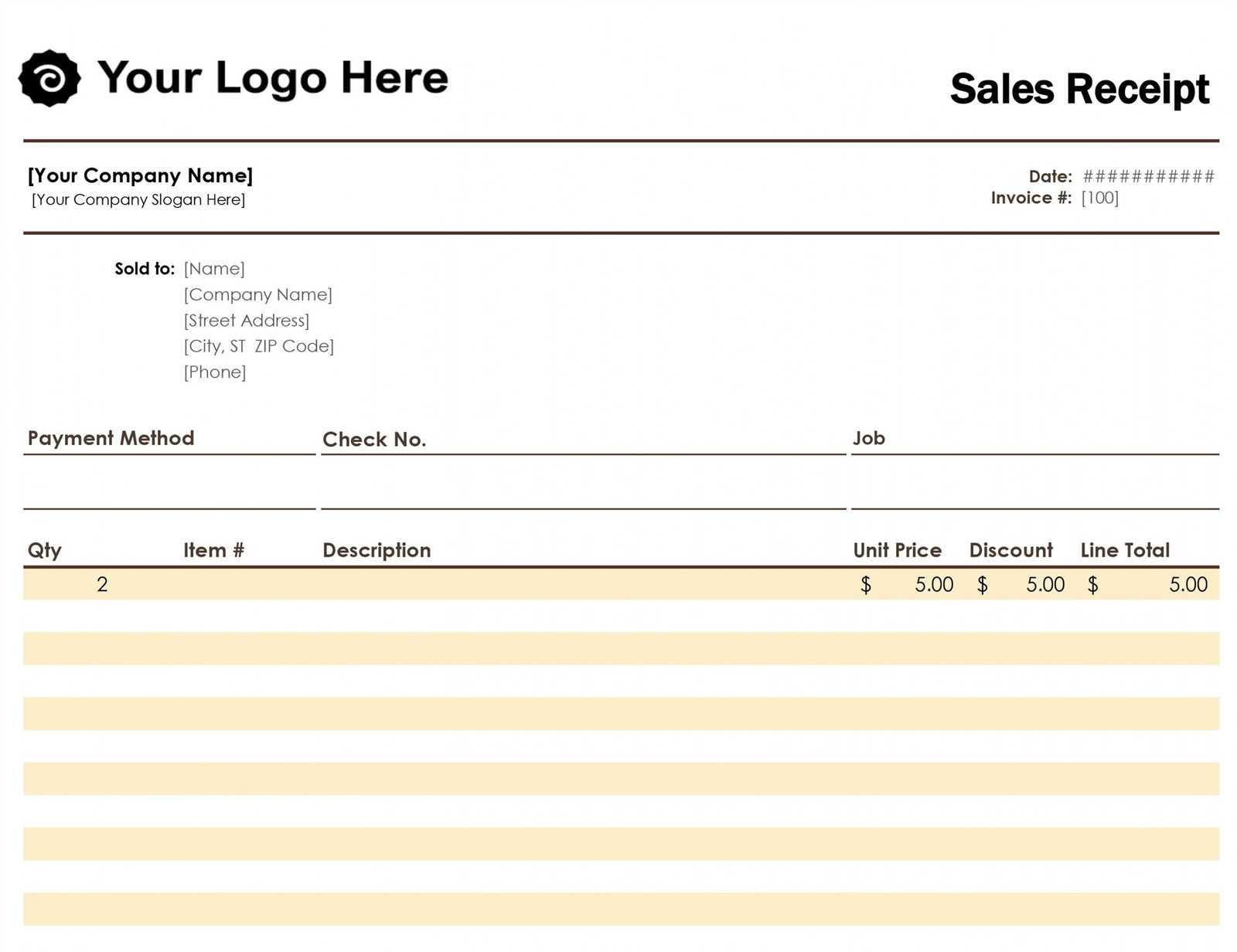
Creating a clear and concise sales order receipt template can streamline transactions and avoid potential misunderstandings. Ensure your template includes key details such as customer name, order number, item descriptions, and total amount. A well-organized receipt not only serves as proof of the transaction but also improves communication with clients.
Structure your receipt so that it is easy to read. Use a simple layout with clearly defined sections for each category. Include an itemized list for products or services, along with their individual prices and any applicable taxes or discounts. It is important to show the total cost, including the final amount due, along with any payment methods used.
By customizing your template with your company logo, contact information, and terms of sale, you can add a professional touch to each transaction. This helps build trust and reinforces your brand image. Don’t forget to include a section for your company’s return policy or any specific instructions related to the order.
Sales Order Receipt Template Guide

A sales order receipt template should clearly display all the key details of the transaction. Focus on the following fields to create a structured and readable document:
Key Elements of a Sales Order Receipt
Start with a header that includes your company name, logo, and contact details. This provides immediate identification for the customer. Next, include the order number, date, and customer information. These elements help track and reference the order with ease. The line items should list each product or service sold, along with quantities, unit prices, and the total price for each item. Ensure this section is organized and easy to read to prevent confusion.
Payment and Shipping Information
Be sure to include the payment method, whether it’s a credit card, bank transfer, or another option. This ensures clarity on how the order has been paid. Shipping details, including the method, cost, and estimated delivery date, are also crucial. Clearly state the total order value at the bottom, including any taxes or discounts, for transparency. This will provide the customer with a complete overview of their transaction.
Key Components of a Sales Order Receipt
A sales order receipt should provide clear and detailed information for both the customer and the seller. Start with the receipt number, which helps track and reference the transaction. This number should be unique for each order.
Include the order date and delivery date to clarify when the purchase was made and when it is expected to be delivered. This timeline is critical for both parties to manage expectations.
Customer and Seller Information
Display both the customer’s name and contact details, along with the seller’s company name and contact information. This ensures transparency and provides a way for either party to follow up if needed.
Itemized List of Products or Services
The receipt must show a detailed item list, including descriptions of the products or services purchased, along with their quantity and unit price. Include any discounts or promotions applied to the order. This breakdown ensures both the seller and the buyer are on the same page regarding what was bought.
Finally, include the total amount and any applicable taxes, such as sales tax, to avoid confusion. The breakdown should be clear and easy to read, leaving no room for ambiguity.
Formatting and Customization Tips
Adjust font size and style to improve readability. Use a clear, professional font like Arial or Helvetica, and avoid overly decorative fonts that can distract from the message. Keep font sizes consistent throughout the document to maintain a clean layout.
Header Design
Make your headers stand out by using bold text or increasing the font size. A larger, bolded header provides a clear separation between sections and guides the reader through the document. Ensure the header color contrasts well with the background for easy visibility.
Customizing Layout
Incorporate tables for organized data presentation, such as order details or pricing breakdowns. Keep columns aligned and limit the number of rows to avoid overwhelming the reader. Add borders or shading to distinguish different sections of the table, helping users to quickly find relevant information.
For a polished look, maintain uniform margins and spacing. Ensure the text blocks do not appear crowded, and use bullet points to break up lengthy paragraphs. This makes the document easier to scan and improves the overall user experience.
If you wish to include your logo, place it in the header or footer in a size that does not dominate the page. This maintains a professional appearance without distracting from the order details.
Lastly, choose color schemes wisely. Stick to a maximum of two or three colors to keep the design cohesive and easy to read. Avoid excessive use of bright colors that can make the document hard on the eyes.
Common Mistakes to Avoid in Templates
Ensure that your template is clear and easy to read. Avoid cluttering it with excessive details that may confuse the user or obscure important information.
1. Incorrect Field Labels
Labels should match the data they are collecting. Using ambiguous or unclear terms can lead to misunderstandings or missing information. Be specific about what you’re asking for, such as “Shipping Address” instead of just “Address”.
2. Overcomplicating the Layout

A complicated layout makes it hard for users to navigate through the form. Stick to a simple structure. Avoid using multiple fonts or colors that can distract or confuse users.
3. Missing Mandatory Fields

Don’t skip marking essential fields. Clearly mark required fields with an asterisk (*) or another distinguishing feature. This prevents errors during submission and reduces incomplete orders.
4. Poor Alignment
Proper alignment of text, buttons, and fields keeps the form tidy and user-friendly. Misaligned sections can make the form look unprofessional and hard to follow.
5. Lack of Instructions
Provide concise instructions where necessary. Users should never feel unsure about how to fill out a field. Brief tooltips or instructions can guide them through the form seamlessly.
6. Overloading the Template with Options
Too many choices can overwhelm users. Limit the number of options in dropdown menus or checkboxes. If the template requires multiple choices, consider grouping them logically.
7. Ignoring Mobile Compatibility
Don’t forget that many users will access the form from mobile devices. Ensure that the template is responsive and adapts to various screen sizes without losing functionality.
8. Failure to Test
Always test your template with different users before finalizing it. This helps identify potential issues, whether it’s a technical problem or unclear instructions. User feedback is crucial for improvements.